Gestures in SwiftUI [2019]
Swipe like you do in Tinder, create a GestureState property wrapper, and more
Gesture recognition is responsible for listening to a certain sequence of touch inputs and reacting accordingly. We can define actions from these interactions and even compose multiple gestures that work in sequence or simultaneously.
GestureState is a property wrapper that works only with gestures. It’s responsible for updating the property value of the state as the gesture changes and resetting it to the initial value once the gesture finishes.
GestureState is an immutable property, unlike State.
Currently, SwiftUI supports five gesture modifiers:
However, we can still create our own custom gestures or combine the above gestures to make complex interactions as well. The following are the three composite types that are used to combine gestures in different ways:
Simultaneous— all the gesture patterns work together with this typeSequenced— brings an order among the gestures such that the second gesture doesn’t receive any events until the first endsExclusive— is used when only one of the gestures would succeed
Our Goal
- In the next few sections, we’ll be working through each of the simple gesture modifiers. Subsequently, we create a composite gesture out of a few.
- Additionally, we’ll compose a gesture for swiping views that’s fairly common in dating apps, such as Tinder.
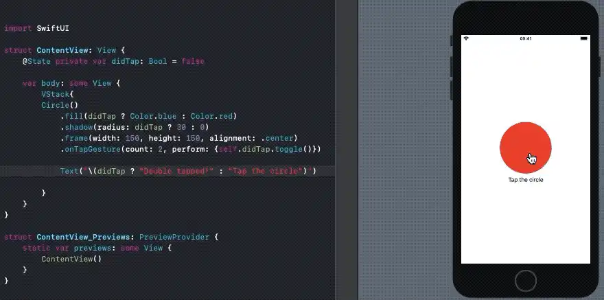
TapGesture
A TapGesture ends when the specified number of taps happen on the view it’s attached to. The following SwiftUI sample adds a TapGesture on a Circle and changes the color and shadow once the gesture is finished:
@State private var didTap: Bool = false

var body: some View {

    Circle()
        .fill(didTap ? Color.blue : Color.red)
        .shadow(radius: didTap ? 30 : 0)
        .frame(width: 150, height: 150, alignment: .center)
        .gesture(TapGesture()
            .onEnded {\_ in
                self.didTap.toggle()
            }
        )
    }
In order to set up a double-tap/multiple-tap gesture, simply change the TapGesture() to TapGesture(count : 2).
Alternatively, we can use the onTapGesture{} closure directly on the Circle, as shown in the below illustration:
LongPressGesture
A LongPressGesture ends when the user presses the view for the specified duration. The following code adds the LongPressGesture on a rectangle. Once the gesture is finished, the view shows a scale effect.
struct ContentView: View {
    @State private var didLongPress: Bool = false

    var body: some View {

        Rectangle()
            .foregroundColor(Color.purple)
            .cornerRadius(40)
            .scaleEffect(didLongPress ? 1.2 : 1)
            .frame(width: 200, height: 200, alignment: .center)
            .gesture(LongPressGesture(minimumDuration: 1.0)
                .onEnded({_ in self.didLongPress.toggle() }))
            .animation(.easeInOut)
    }
}
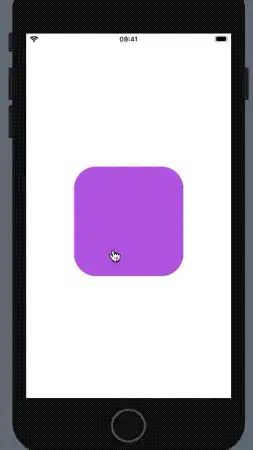
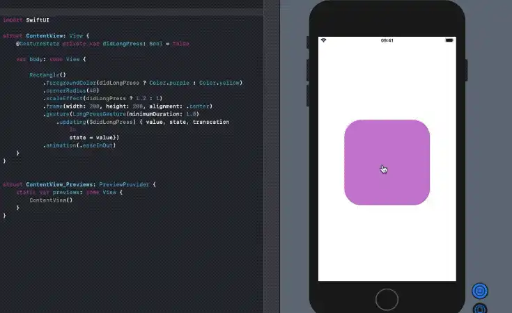
LongPress Using GestureState
In the above illustration, in order to get back to the initial position, you need to do a long press again or tweak the code by adding the toggle in the onChanged function. This can be simplified by using GestureState instead, as shown below:
struct ContentView: View {
    @GestureState private var didLongPress: Bool = false

    var body: some View {

        Rectangle()
            .foregroundColor(Color.purple)
            .cornerRadius(40)
            .scaleEffect(didLongPress ? 1.2 : 1)
            .frame(width: 200, height: 200, alignment: .center)
            .gesture(LongPressGesture(minimumDuration: 1.0)
                .updating($didLongPress) { value, state, transcation in
                    state = value})
            .animation(.easeInOut)
    }
}
The updating function is responsible for returning the transient events during the events. Once the gesture ends, the GestureState would reset to the initial value thereby bringing a nice grow-and-shrink effect.
Before we work through the next three gestures, let’s get an important hurdle out of the way:
The order of gestures is crucial
For scenarios where you plan to use a long press and tap gesture together, the order is important. A LongPressGesture placed after a TapGesture would allow both to work independently, whereas reversing them would cause the TapGesture to be ignored, as shown below:
.onTapGesture {print("This will work")}
.onLongPressGesture(minimumDuration: 0.1){print("This will work")}


.onLongPressGesture(minimumDuration: 0.1){print("This will work")}

.onTapGesture {print("**This would not be recognised**")}
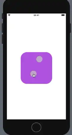
DragGesture
A DragGesture can be used for swiping cards (e.g., vertically or horizontally in Maps or Tinder). The following code shows one such SwiftUI example:
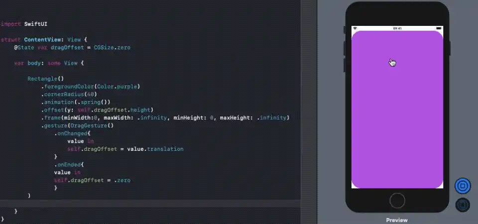
In the above code, the onChanged event contains the drag values from which we can determine the current properties such as size, width, height, etc. We’ve used the height property to change the offset of the rectangle. The onEnded event resets the size to the initial value.
Magnification and Rotation Gestures
These are two hand gestures and work in similar ways to the DragGesture. The onChanged event of the magnification gesture returns a CGFloat value that can be used to scale the view accordingly, whereas the rotation gesture returns an Angle property value which is used on rotationEffect to bring about the rotation.
The following code demonstrates both the magnification and rotation gestures working together simultaneously:
struct ContentView: View {
    @State var magnificationValue: CGFloat = CGFloat(1)
    @State var rotationValue: Angle = .zero

    var body: some View {

        Rectangle()
            .foregroundColor(Color.purple)
            .cornerRadius(40)
            .scaleEffect(magnificationValue)
            .rotationEffect(rotationValue)
            .frame(width: 200, height: 200, alignment: .center)
            .gesture(MagnificationGesture()
            .onChanged { value in
            self.magnificationValue = value
            }
            .simultaneously(with: RotationGesture().onChanged { value in
                    self.rotationValue = value
            }))

    }
}
We get the following result in our SwiftUI live previews:
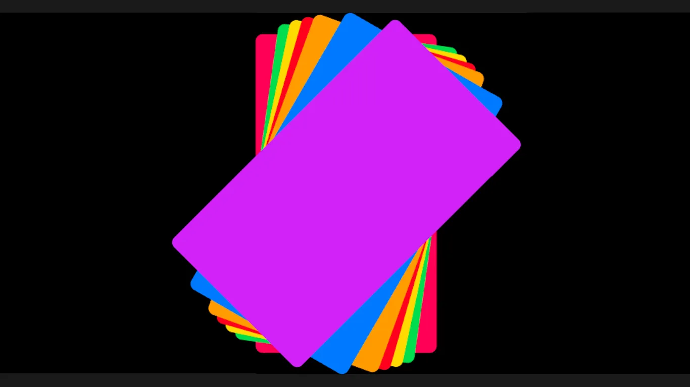
Build a Tinder-Like Swiping Gesture
Swiping right and left to accept and reject is the norm of dating apps today. In this section, we’ll do that using SwiftUI.
For creating a swipeable interaction, we’ll leverage the DragGesture, which has a rotation effect after some part has been dragged. In the following code, we’ve added some rectangular cards in a ZStack with the gesture modifier set on each of them:
When the drag ends, we check for the distance covered. Based on that, we decide whether it passes the swipe threshold or not. Additionally, there’s a scale effect as well.
The SwipeObserver class is responsible for updating the states based on the gesture interactions. The EnvironmentObject is instantiated in the SceneDelegate class in the following way:
UIHostingController(rootView: contentView.environmentObject(SwipeObserver()))
The following code tracks the drag state of each of the cards and updates the SwiftUI body accordingly:
class SwipeObserver : ObservableObject{

    @Published var cards = [Cards]()

    init() {

        self.cards.append(Cards(id: 0, drag: 0, degree: 0, color: Color.purple))
        //Skipping for brevity
    }

    func update(id : Cards,value : CGFloat,degree : Double){

        for i in 0..<self.cards.count{

            if self.cards[i].id == id.id{

                self.cards[i].drag = value
                self.cards[i].degree = degree
            }
        }
    }
}
Each of the cards holds the drag and degree state:
struct Cards : Identifiable {

var id : Int
var drag : CGFloat
var degree : Double
var color : Color

}
As a result, we get the following outcome in our application:
Conclusion
SwiftUI gestures — along with animations and transitions — can create some pretty immersive user experiences.
We worked with the different kinds of gestures and saw the role GestureState plays in handling the transient interactions with the designated view. Subsequently, we made a composite gesture that rotates and magnifies at the same time.
We demonstrated swipeable view gestures, as done in Tinder, as an icing on the cake. Its source code is available in this GitHub repository.