SwiftUI Introspect — Accessing UIKit Components Under SwiftUI Views
SwiftUI was the talk of the town during WWDC 2019. Despite the limited set of tools, it created a euphoria due to the ease with which you can build user interfaces. Gladly, a lot of the SwiftUI components are built on top of UIKit. Besides, the SwiftUI and UIKit interoperability allows us to harness UIViewRepresentable and UIViewControllerRepresentable — both of which let you port UIKit components into SwiftUI.
But we already know that! So what’s the purpose of this article?
In the next few sections, we’ll look into an amazing SwiftUI library (Introspect) that lets us access the underlying UIKit views.
We’ll cover the following topics:
- How does the Introspect library work under the hood?
- How do you disable scrolling of a SwiftUI list?
- How do you add Pull to Refresh controls in a SwiftUI list?
- How do you customize Segmented Style Pickers in SwiftUI?
- How do you update the NavigationView and TabView colors?
- How do you make the SwiftUI TextField a first responder?
Under the Hood
The Introspect library works by adding a custom overlay to the view hierarchy and then looking into the UIKit hierarchy to find the relevant view.
If the above lines didn’t make much sense, let’s look at the following illustration to understand how the introspection library works under the hood.
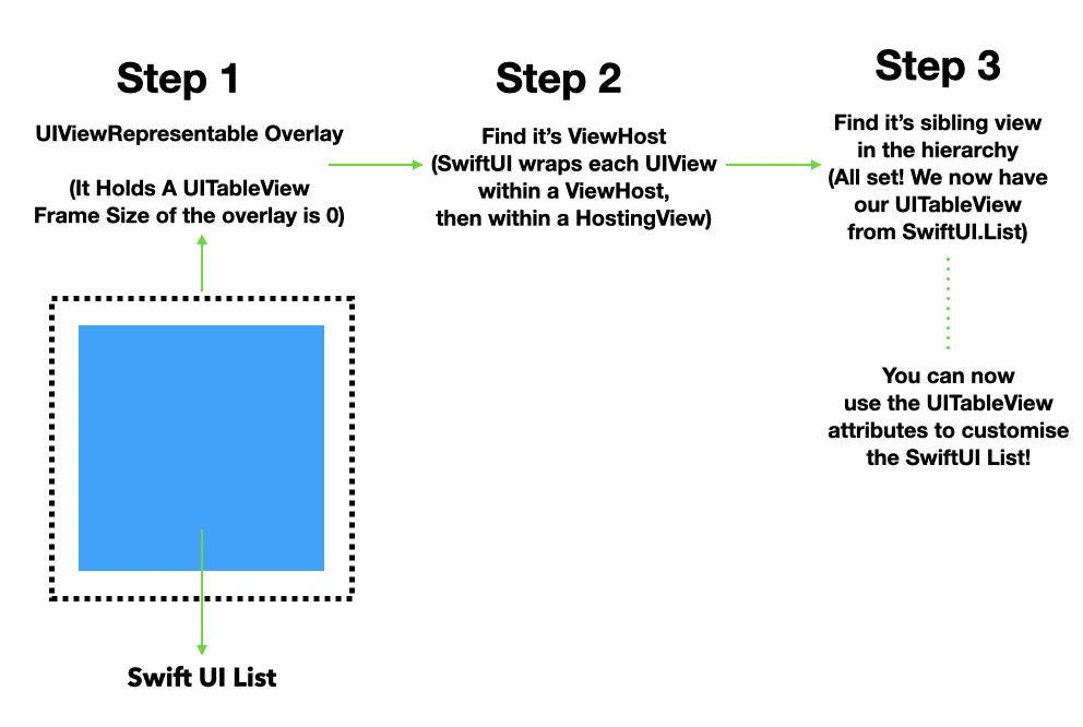
Essentially, we’re overlaying an invisible UIViewRepresentable on top of a SwiftUI view. The view will dig through the chain of views and eventually find the UIHostingView that’s hosting the SwiftUI views. Once we’ve got that, we can access the UIKit view present within the UIHostingView.
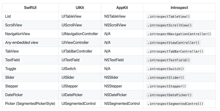
Not all SwiftUI views can be inspected. For example, SwiftUI’s Text is not built on top of a UILabel. Similarly, Image and Button aren’t built on top of UIImageView and UIButton. Hence, we cannot access their underlying UIKit views — since they don’t exist. The following table showcases the SwiftUI views that can be inspected:
Let’s look at some scenarios where inspecting the underlying UIKit views allows us to build on the currently missing features of SwiftUI.
Disable SwiftUI List Scrolling
SwiftUI List currently does not possess an isScrollEnabledproperty for customizing the scrolling abilities, as we’d do in UITableView. By using a VStack + ForEach, we can work around that. But there’s still a shortcoming: The click effect that we’d usually have with a SwiftUI list or UITableView row is absent.
Instead, by using introspectTableView viewModifier, we can disable the scrolling easily while preserving the native list features, as shown below:
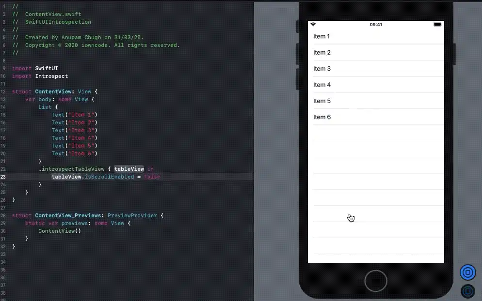
Likewise, to hide the separator lines between the SwiftUI list elements, we’ll simply invoke tableView.separatorColor = .none once we’ve got a hold of the underlying UIKit view.
Pull to Refresh in SwiftUI List
SwiftUI List doesn’t provide built-in support for refreshing at the time of writing. In an earlier article, we did a workaround implementation (though it isn’t best when using large lists). Gladly, we can reduce the boilerplate code even further by setting the UIRefreshControl on the underlying UITableView of the SwiftUI list, as shown below:
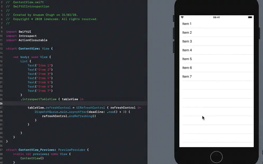
Note: We cannot define objc functions in SwiftUI structures. So we used a library to define the selector of the UIRefreshControl as a closure.
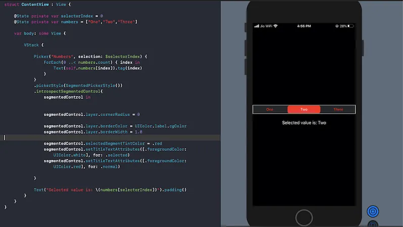
Customizing Segmented Control in SwiftUI
SwiftUI lets us set SegmentedPickerStyle on Pickers. But there are currently a lot of limitations: Customizing the border, radius, title, and background attributes isn’t possible.
Again, by leveraging the underlying views, we can customize the appearance of Segmented Controls in SwiftUI. In the following example, we’ve removed the corner radius from Segmented Controls and set the border color around it:
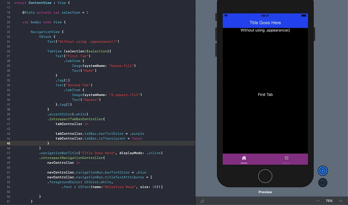
Customizing NavigationView and TabView Styles
Changing the color of the title text in a NavigationBar isn’t straightforward. The same holds for TabView. While one could suggest using the init method for changing the appearance — like it’s done below — it isn’t really a good solution:
init() {

    UINavigationBar.appearance().titleTextAttributes =
    [.foregroundColor:UIColor.red]

    UINavigationBar.appearance().backgroundColor = .green
    UITabBar.appearance().backgroundColor = UIColor.blue
}
This implementation doesn’t really customize the NavigationView or TabView. Instead, it overrides their appearances globally.
We have a much better workaround for this. For example, the following code snippet updates the NavigationBar title and background color in a concise manner:
By inspecting the TabView and NavigationView, we were able to modify their respective UIKit views:
Making TextField a First Responder in SwiftUI
SwiftUI currently provides no way of popping up the keyboard automatically. Unless we do something, the user has to manually focus on it. Once again, we can access the underlying UITextField and invoke the becomeFirstResponder function, as shown below:
Closing Thoughts
We saw how inspecting the underlying UIKit views lets us overcome the limitations of some SwiftUI components. We started off with lists, customizing their appearance and leveraging the ScrollView API (it’s lacking in SwiftUI). We also touched on how to customize the attributes of Segmented Controls, NavigationViews, TabViews, and TextFields.
Moving forward, you can customize Steppers, Sliders, and DatePickers in SwiftUI until Apple bumps it up — probably at WWDC 2020.