7 SwiftUI Tips — Little Known Features
SwiftUI has changed the way we build user interfaces in our iOS applications. The declarative state-driven framework is concise and easy on the eyes primarily due to function builders that power the DSL language.
With the number of features that have already been presented since its debut, keeping track of some cool tricks can become a challenge. Thankfully, this blog is just the cheat sheet for such cases.
In the following sections, I’ve compiled a list of tips that should help build SwiftUI applications easily. Let’s get started.
Wrap Views in AnyView or Groups When You Have Different Types
The some keyword was introduced in Swift 5.1 for defining opaque types. It allows the compiler to decide the concrete type of the function based on the returned value.
While this is all good for single-branch code or when the view types are alike, it would lead to a compiler error when you have multiple-branch code with different views.
Specifically, the SwiftUI interface wouldn’t be able to determine a single opaque type. We can work around this by wrapping the set of views in a Group or AnyView.
AnyView ensures that there’s a single opaque return type, but make sure you don’t use this too often.
//with groups
var body: some View {
    Group {
        if Bool.random() {
            Text( "Hello, User!")
        } else {
            Image ("not. found" )
        }
    }
 }

//with AnyView
var body: some View {
    if Bool. random {
        return AnyView(Text( "Hello, User!"))
    }
    else{
        return AnyView( Image "not. found" ) )
        }
    }
}
The tip above is useful when using switch statements in the SwiftUI body as well. However, a better alternative in such scenarios would be to extract the switch statement in a separate function.
Prevent the Reload of Whole SwiftUI Body on State Changes by Decoupling Independent Views
Being a state-driven framework, whenever a state is changed, all the views in the SwiftUI body get refreshed — including the ones that weren’t bound to that state.
Sometimes, you might wish there was a way to avoid refreshing the whole body. Luckily, you can do this by separating the views that aren’t dependent on the state, as shown below:
struct ContentView: View {
    @State var isActive = false
    var body: some View {
        VStack {
            RandomText ()
            Button(action: { self.isActive.toggle() }) {
                Text("Show sheet") }
            .sheet(isPresented: $isActive) {
                Text("I am a pop up sheet")
            }
        }
    }
}


struct RandomText: View {
    var body: some View {
        Text ("Number: \(Int.random(in: 0...10))")
    }
}
In the code above, the RandomText no longer refreshes the text when the bottom sheet is presented or dismissed.
Keep the init Code Block for Custom Views Short
It’s important to note that the constructor of custom views in a SwiftUI body is called every time the super view refreshes. However, this doesn’t imply the whole custom view gets reconstructed.
For example, a custom SwiftUI camera view will invoke its init block every time but wouldn’t reconstruct the AVFoundation capture sessions every time (unless you’re passing a state property wrapper that triggers a change in it).
As such, ensuring that the init block isn’t too heavy is a good idea.
Use SwiftUI Images Efficiently
Alongside SwiftUI, iOS 13 introduced SF Symbols, which boasts a collection of images. We can customize them in our SwiftUI Images easily with modifiers like font that are applied in the same way as with SwiftUI Text.
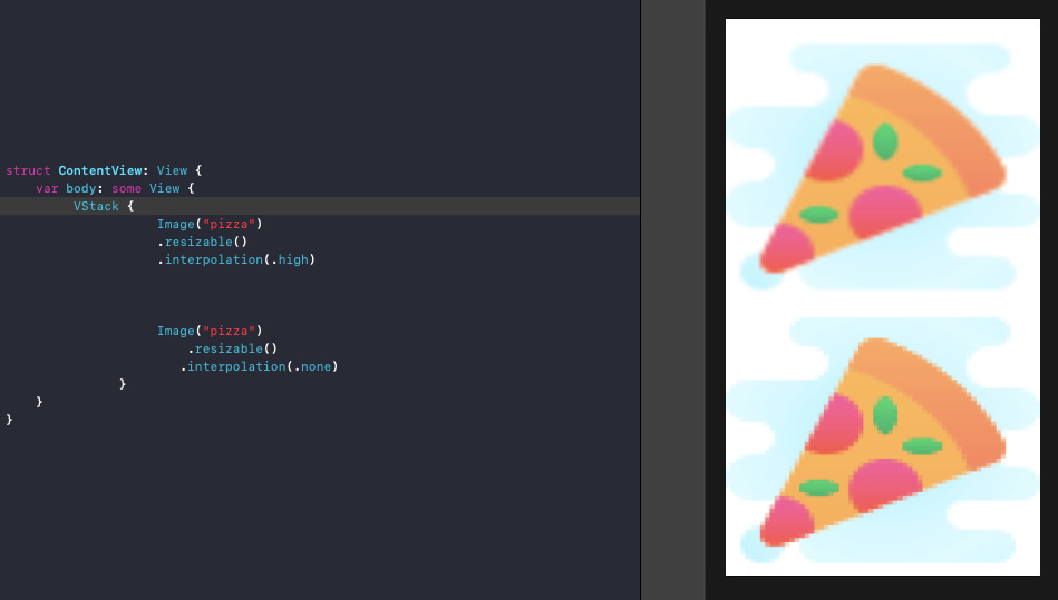
Leverage interpolation
Often, you have image assets that require stretching the contents beyond their size. You could end up with blurry images, as the interpolation that works by default blends the pixels.
By setting the interpolation modifier to none, you can ensure that blending doesn’t happen and the pixelated image is smooth.
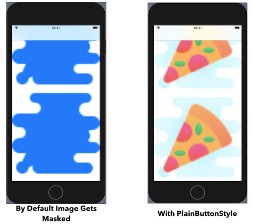
Dealing with images in NavigationView
Another crucial scenario of SwiftUI Images is when they’re embedded in a NavigationLink. By default, the images would get masked with the tint color (which is blue when placed in a NavigationView). To avoid this overlay, we need to set .buttonStyle(PlainButtonStyle()) on the NavigationLink, as shown below:
var body: some View{
    NavigationView{
        ScrollView{
            VStack{
                ForEach((1...10).reversed(), id: \.self){ _ in
                    NavigationLink(destination: Text ("Hey")){
                        Image("pizza").resizable().scaledToFit()
                    }
                    .buttonStyle(PlainButtonStyle())
                }
            }
        }
    }
}
Here’s the output(s) with and without the PlainButtonStyle set on the NavigationLink:
Handling Multiple Previews
We know that SwiftUI provides us with real-time previews, but what makes it even more interesting is the ability to show multiple previews — be it for dark mode or different device models.
Here’s an example that shows the same SwiftUI view in a light and dark mode.
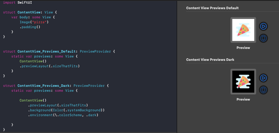
Dark mode in previews is half-working by default. Instead of setting the system background color like above, you can refer to this Stack Overflow post to use the view modifier extension as a fix.
We can also Group the Content Previews or use a ForEach loop that displays the UI in different devices, as shown below:
struct ContentView_Previews_Devices: PreviewProvider{
    static var previews: some View {
        ForEach( [" iPhone 5"
                  , "iPhone 11", "iPhone 6s"], id: \.self){ deviceName in
            ContentView()
                .previewDevice(PreviewDevice(rawValue: deviceName))
                .previewDisplayName(deviceName )
        }
    }
}
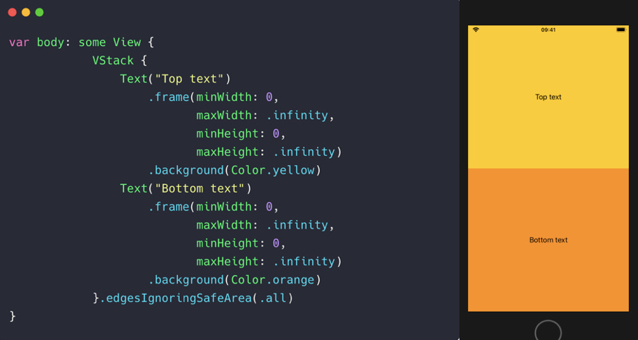
Leverage Frame Modifier for Filling Views
By default, views occupy minimal space on the screen. For instance, the following TextView wraps itself:
var body: some View {
    VStack{
        Text("SwiftUI Text Default" )
            .background (Color.yellow)
        Text("Another text")
            .background (Color.orange)
    }
}

To expand the views to fill the super view space, we can leverage the frame modifier and set the maxWidth and maxHeight properties in it to infinity, as shown below:
Use Custom Modifiers and Extensions
By using view extensions, we can extend built-in functionalities, thereby simplifying our code and improving readability. For instance, wrapping views in an AnyView or embedding them in a NavigationView is a fairly common exercise. We can create extensions for them like so:
extension View {
    func embedInNavigation() -> some View {
        NavigationView { self }
    }
}
extension View {
    func anyView() -> AnyView {
        AnyView(self)
    }
}

AnyView(Text( "Hey there!"))

//use this instead:
Text( "Hey there!")
    .anyView()
Taking a cue from this, you can create an extension for a SwiftUI Image as well and set a default placeholder image.
SwiftUI provides us with a range of view modifiers that can be chained together as building blocks. But sometimes, you end up with the same set of modifiers — specifically when customizing views. This can create boilerplate code that could be avoided by using custom view modifiers.
The code below shows one such view modifier that creates a custom style:
struct ContentView: View {
    var body: some View {
        Text ( "Hello" )
        .modifier(CustomStyle())}
}

struct CustomStyle: ViewModifier {
    func body(content: Content) -> some View {
        content
            .font( .system(.title, design: .rounded))
            .foregroundColor(.white)
            .frame(maxWidth: .infinity)
            .background (Color.blue)
            .cornerRadius(6)
            .padding()
    }
}
Bonus Tip
Often, an error while writing code in SwiftUI stops the preview and we need to press the “Resume” button again. As this happens a lot, you can use the Option + Cmd + P shortcut to quickly resume.